Going Mobile: The Importance of Responsive Web Design
If you use a smartphone, you have likely been frustrated by a mobile web experience in the not-so-distant past. Maybe the text was so small you had to zoom in to read anything, or half the web page overflowed off the screen. 47% of Americans have admitted to throwing their phone in anger when a pop-up window on a non-responsive site obscured their entire screen. That statistic is made up, but rest assured the rest in this article are very real.
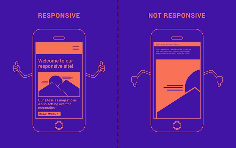
These upsetting mobile experiences occur on sites that are not responsive. They were designed with a desktop view in mind and just can’t handle the mobile scene. Bummer city town! When a mobile user visits a site that isn’t responsive, they are guaranteed a poor user experience. If this is their first impression of your business, it’s easy for them to lose interest and move on to one of your competitors instead.
WHAT IS RESPONSIVE WEB DESIGN?
If you’re not familiar, “Responsive Web Design” is the method of designing a website that can reformat depending on the size of a user’s screen. Users visiting your site on a desktop computer will see a design that makes use of the larger space with a more robust layout. Meanwhile, users visiting on mobile devices receive the same content presented in a smaller, more simplified, user-friendly format. With new electronic devices (and screen sizes) popping up constantly, it’s important to develop a site that can keep up.
Why, you ask?
Make New Friends
Today, approximately 71% of Americans own a smartphone (*real statistic alert*), and they’re not just teenagers and young adults. 67% of adults ages 55+ report they use the internet on both desktop and mobile devices. The mobile revolution does not discriminate, and market saturation is only increasing. Mobile web use overtook desktop visits last year, and roughly 20% of web users have converted to a mobile-only lifestyle. The amount of worldwide mobile users is forecast to hit 4.77 billion people in 2017. Can you imagine your message missing out on that many eyes? That’s 9.54 billion eyes!
All About The Benjamins
Before responsive design became the standard, it was common for businesses to have two sites – one for desktop and one for mobile. This meant twice the development time, twice the $$, and once the sites were complete, you had two sites to keep up-to-date. By upgrading to a responsive site, you save yourself future frustration and make the most of time and money spent.
Put the O in SEO
Search engine optimization is a crucial part of getting users to your site. The goal of every search engine (i.e. Google) is to provide their users with the best, most relevant content possible. To achieve this, they consider several factors. Search engine bots crawl your site to catalog its content, but content isn’t the only thing search engines take into account when indexing your site. They’re also looking for sites with a good user experience that their audience will find easy to navigate. Therefore, bots prefer responsive sites for their condensed code and simple hierarchy.
The bots also look at your site’s bounce rate to judge whether visitors find your site helpful. A “bounce” occurs when a user visits your site and immediately leaves, usually either because it wasn’t what they were looking for, or worse, the content was presented poorly. To put it simply, a responsive site means a higher ranking on Google.
Whether you’re looking to redevelop an existing site or you’re starting from scratch, implementing a responsive design should be your top priority.
As a web design company in NJ, we understand the importance of an optimized web experience and mobile apps marketing.
Not sure if your site is mobile-friendly? Click here to find out!
Uh oh, not mobile-friendly? Check out our responsive web design services to see how M studio can help!